Insights
Learnings and interviews on the making of visual investigations.
How to
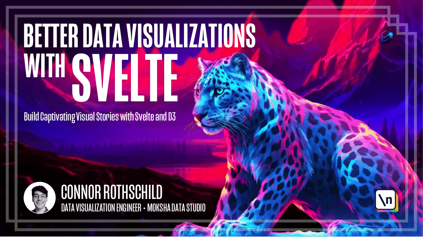
Better Data Visualizations with Svelte |...
Learn how to declaratively build responsive, interactive data visualizations with Svelte and D3.
1 years
Research
Sigma Awards: 10 Lessons for Data Journa...
The Sigma Awards celebrate the best in global data journalism. Here, the founders speak about lessons learned from the most recent...
1 years
Interviews
AI, Personalisation and Visual Journalis...
Nic Newman is the editor of the annual Digital News Report. In this conversation we explore the significant impact of visual jour...
10 months
Interviews
Illustration in Journalism
Using illustration in journalism: process, context and tools.
1 years

Interviews
What is Narrative, Anyway?
Interview answers on the definition of narrative.
1 years

Research
Nieman Program On Narrative Journalism
The Nieman Program on Narrative Journalism currently has five major activities: the Nieman Narrative Digest, organizing the 1,000-...
1 years

How to
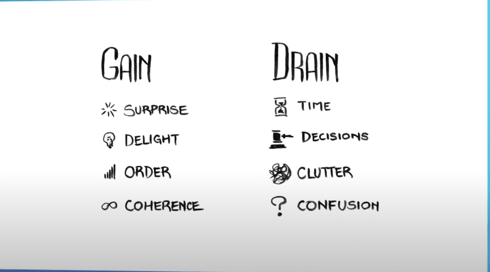
Structuring visual narratives to feed th...
Martinis, pyramids and hourglasses for storytelling.
1 years
Research
Density Design Lab
DensityDesign is a research lab at the Design Department in Politecnico di Milano, Italy. Our research revolves around information...
1 years
How to
On Graphonyms: the Importance of Chart T...
Chart vocabulary.
1 years
Interviews
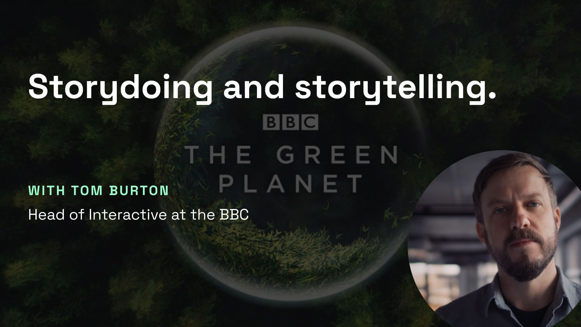
Storydoing and storytelling
Understanding context and audience to balance linear and interactive storytelling.
1 years
How to
Making a Data Visualization With No Codi...
An exercise in building a data visualization with ChatGPT writing—and debugging!—the code
1 years
Interviews
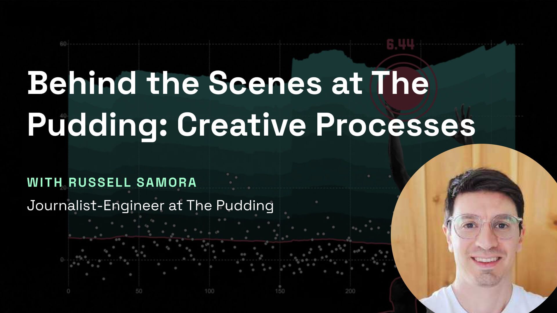
Behind the Scenes at The Pudding: Creati...
An inside look at the creative processes for interactive storytelling at the Pudding.
1 years
Research
Five charts that changed the world - BBC...
Data visualisation helps us to understand the world. It also has the power to change it. Narrated by Adam Rutherford.
2 years
BBC

How to
Six Principles for Designing Any Chart
An introduction to Google’s new data visualization guidelines
2 years
How to
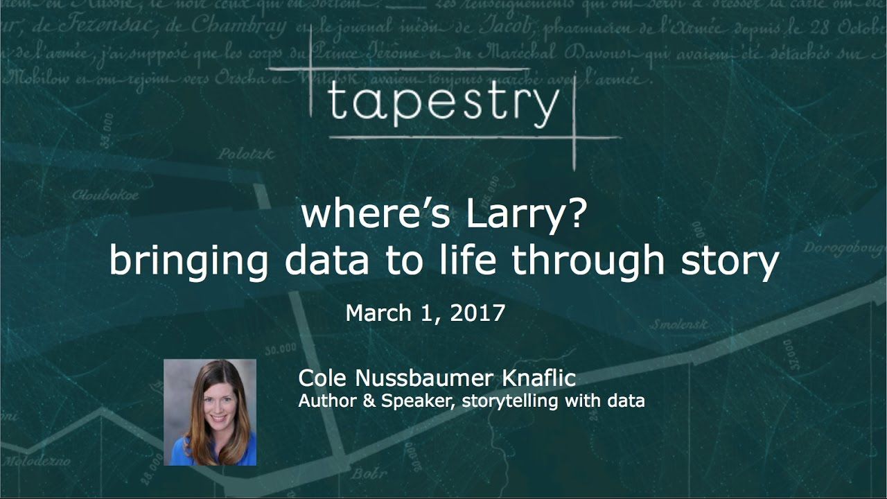
Where's Larry? bringing data to life thr...
Tapestry 2017 Short Story Presentation #3 by Cole Nussbaumer Knaflic
2 years

How to
Once Upon a Time: From Data to Stories
The word “stories” has become synonymous with visualizing and presenting data. But contrar...
10 months
How to
Responsive scrollytelling best practices
How to plan or adapt a scrollytelling story for mobile.
2 years

Interviews
Identifying Visual Potential
We discuss Marco's approach to producing impactful and unique visual stories as well as his definition of success.
1 years
Research
Animation, Pacing, and Exposition
When depicting complex systems, it is not enough for our visualizations to be only beautiful and comprehensive. A good exposition ...
2 years
Interviews
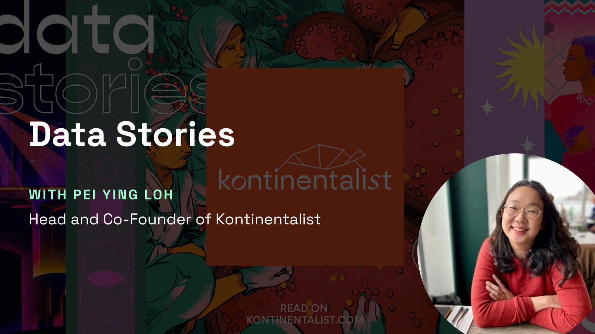
Data Stories - Interview of Pei Ying Loh
Our interview with Pei Ying, Head and co-founder of Kontinentalist, about their processes and creative approach.
1 years
Research
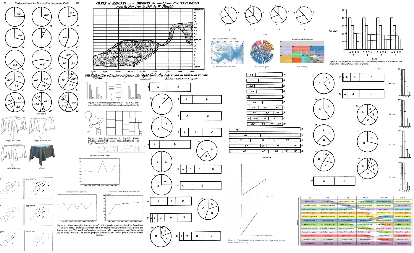
39 studies about human perception in 30 ...
An extreme distillation of many studies done over graphical perception.
2 years
Kennedy Elliot
Research
Perception in Visualization
Human perception plays an important role in the area of visualization. An understanding of perception can significantly improve bo...
2 years
North Carolina State University
How to
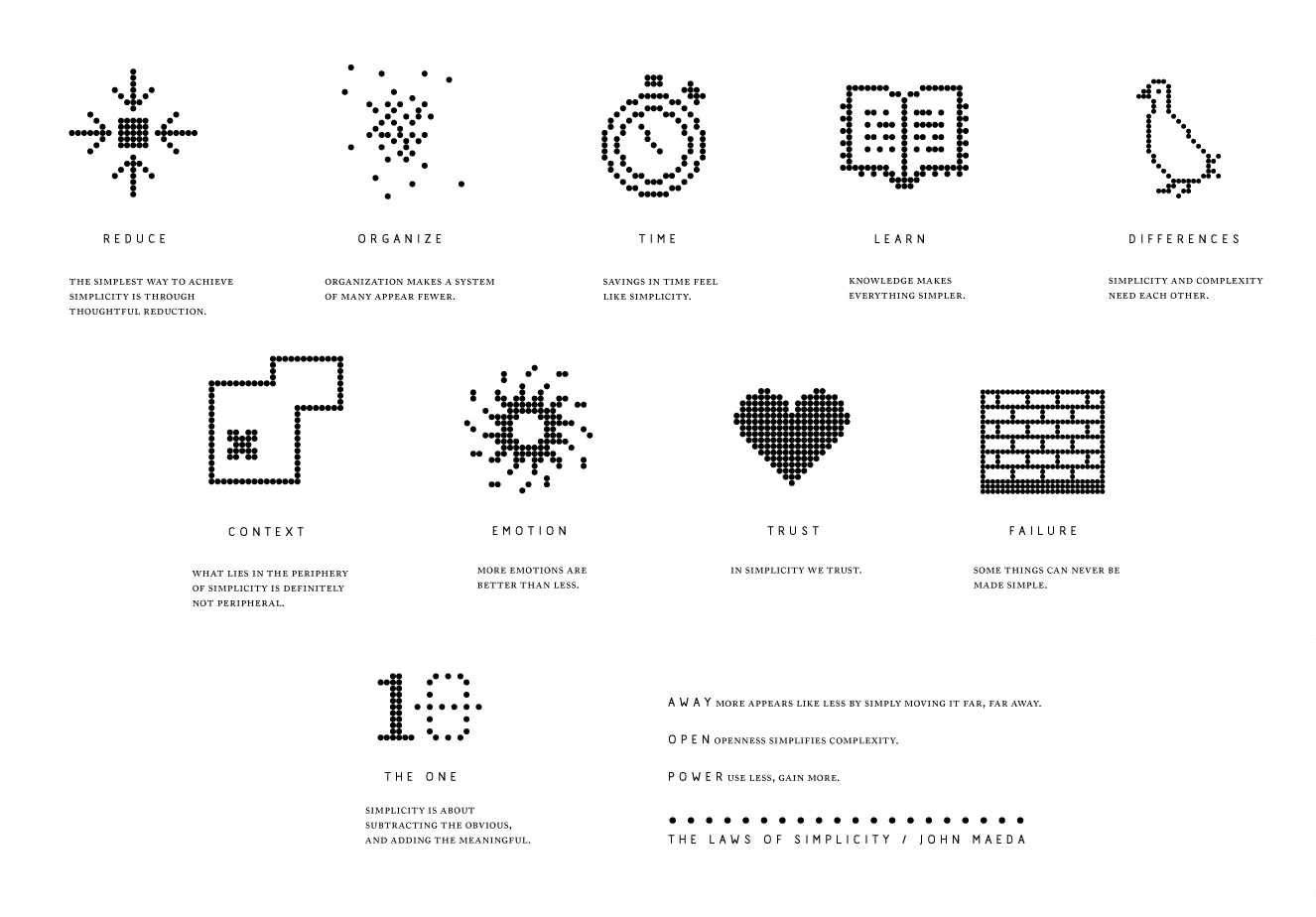
Laws of Simplicity
The Laws of Simplicity is a 100-page book I wrote just as the Apple iPod was starting to take off and while I was earning my MBA a...
2 years
John Maeda

Interviews
Pablo Robles: Immersive Visual Reporting
In this interview with Pablo, a visual journalist at the New York Times, we discuss the importance of physical immersion to gather...
1 years