Inspiration
A repository of data-driven visual stories from around the world, humanising complex issues with design and technology.

3D
The Quest to Restore Notre Dame’s Glorious Sound
In Paris, experts are modeling ways to revive the burned cathedral’s centuries-old acoustics. A Times interactive shows how space can affect what we hear.

Dataviz
Realtime Inequality
Visualizing income and wealth inequality in the U.S. in real time.

Multimedia
Hong Kong: 100 days of protests
Hongkongers have taken to the streets to demonstrate against the extradition bill in huge numbers. The protesters and the government are in no mood to compromise and police have fo...

Interactive
Maps
Here's who lives in your city's worst heat islands
A CBC News data analysis shows that immigrants and people with low incomes are most likely to live in the hottest urban areas.

Interactive
Dataviz
Using career stats to prove the best/worst NBA draft picks, ever
Twenty years of the NBA redrafted.

Dataviz
Goalkeepers: Bill Gates' speeches - Beyond Words Studio
A dynamic big-screen presentation that helped Bill Gates' deliver a speech designed to change the world at the Goalkeepers 2018 event.

Maps
3D
És megremeg a föld
Földrengések 1900-tól napjainkig.

Maps
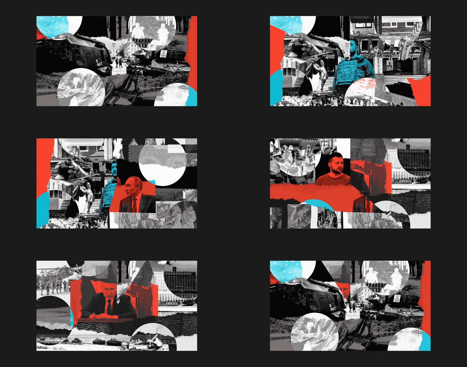
Ukraine, One Year at War: An interactive timeline of the conflict
On Feb. 24, 2022, Russia launches a full-scale invasion of Ukraine. Now, one year later, Grid looks back on how the conflict spread.

Illustration
What makes certain dogs popular in certain countries
Why a starring film role matters for particular breeds of dog.

Dataviz
Visualizing Censorship in Iran
Researching patterns in the repression of the freedom of expression in Iran.

Documentary
NFB The Last Hunt
An interactive story of family, tradition and a cabin in the woods.

Maps
The Two Americas of 2016
A view of two imaginary nations created by slicing the country along the sharp divide between Republican and Democratic Americas.

3D
Dataviz
The Corporations Behind Climate Change
Seven simple demands to hold fossil fuel companies accountable.

Dataviz
Dashboard of the Present Future
Dashboard of the Present Future for the World Data Visualization Prize. Created by Lindsey Poulter.
Inspiration of the Week

Dataviz
United States gun death data visualization
United States gun and firearm killing data visualization by Periscopic.
Inspiration of the Month

Multimedia
Dataviz
In the dark: the internet sparked a revolution, then it was turned off
In recent years, there have been 935 internet shutdowns worldwide, and censorship has worsened. Here’s how authoritarian regimes found an off switch for dissent, using deep packet ...

Cinematic
Zendetta - A Story from Syria
An immersive, interactive web-experience. From political detainee to refugee and activist, a story of survival and revolution through the Syrian uprising.

Illustration
The history of the Forbidden City
How China’s Forbidden City became the Palace Museum: one of humanity’s greatest legacies.

Interactive
Snow Fall: The Avalanche at Tunnel Creek
“Snow Fall: The Avalanche at Tunnel Creek,” by New York Times reporter John Branch, tells the harrowing story of skiers caught in an avalanche.

Illustration
Searching for life in the rubble
How search and rescue teams comb debris for survivors after devastating earthquakes.

Illustration
On the brink
Extinction crisis puts 1 million species on the verge of disappearing.

Dataviz
Hong Kong Artists, Women
A data visualization of Hong Kong women artists.
Inspiration of the Week

Illustration
Cinematic
Fishing the feed
Farmed seafood has a dirty secret. It is fed using billions of wild-caught fish trawled from the oceans. Find out what goes on under the surface.

Illustration
Dataviz
Cantonese Opera: history, performance, theatre and costume design
Cantonese opera is still one of Hong Kong's favourite art forms.