Inspiration
A repository of data-driven visual stories from around the world, humanising complex issues with design and technology.
Inspiration of the Week

Documentary
Les Événements : Centrafrique, dix ans de violence
Un documentaire photographique et sonore au cœur des familles centrafricaines, par Médecins Sans Frontières.

Dataviz
MIT City Lab - Slow Zones
The project exploits the sharp spatial and temporal variation in a traffic speed policy implemented over five years in Paris to identify the effects of slowing cars and making stre...
Maps
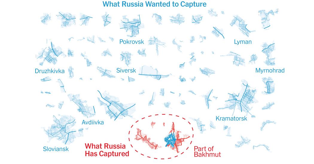
How Russia’s Offensive Ran Aground
Whatever happens in Bakhmut, a once-ambitious winter offensive never really went anywhere.
Interactive
Multimedia
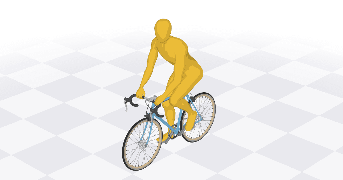
Bicycle – Bartosz Ciechanowski
Interactive article explaining the physics of a bicycle.

Dataviz
Multimedia
The Navy Installed Touch-screen Steering Systems To Save Money. Ten Sailors Paid With Their Lives.
When the USS John S. McCain crashed in the Pacific, the Navy blamed the destroyer’s crew for the loss of 10 sailors. The truth is the Navy’s flawed technology set the McCain up for...
Multimedia
Dataviz
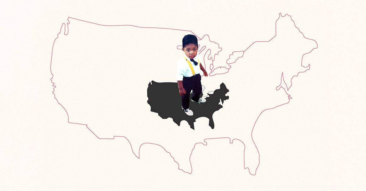
On Upward Mobility
What role did the neighborhood you grew up in have in shaping your economic opportunities? Author Aaron Williams tells a data story about migration, community, and returning to you...

Maps
What Happens If North Carolina Bans Abortion? Or Ohio? Or Florida?
Where is the nearest abortion clinic? Our interactive map shows the distance a woman may need to travel to reach an abortion provider if proposed abortion restrictions pass.

Interactive
The Climate Game — Can you reach net zero?
See if you can save the planet from the worst effects of climate change.
Illustration
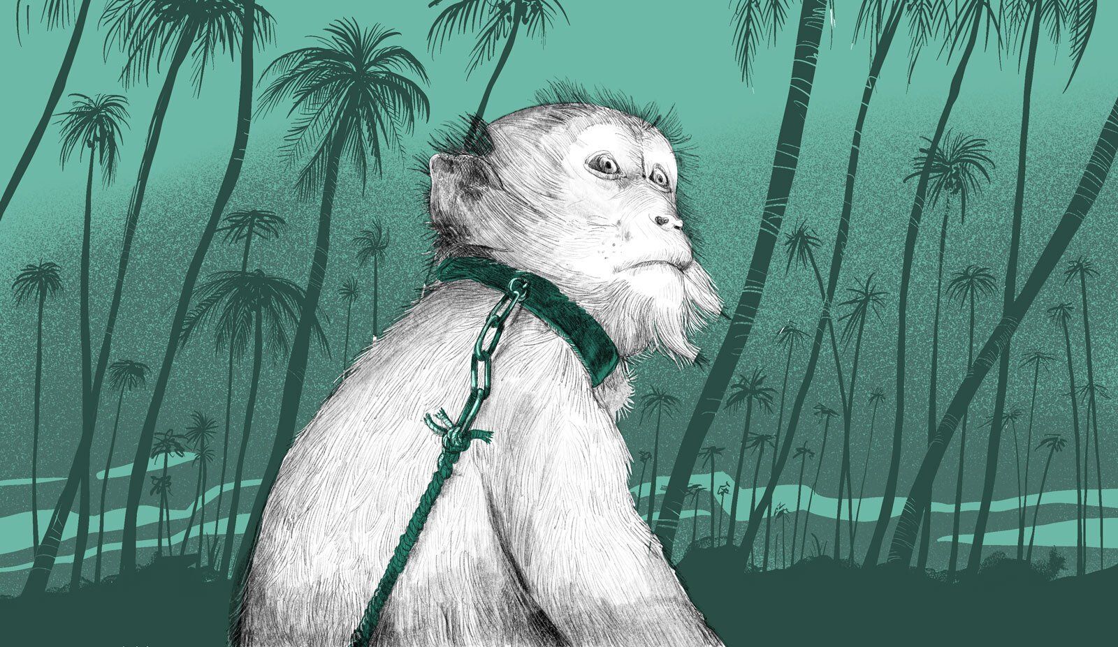
Monkey helpers or coconut slaves?
Reports of monkey abuse in Thailand have seen coconut products removed from supermarkets in Europe. Find out why from our infographics.

3D
What does an AR-15 do to a human body?
This is how bullets from an AR-15 blow the body apart.
Maps
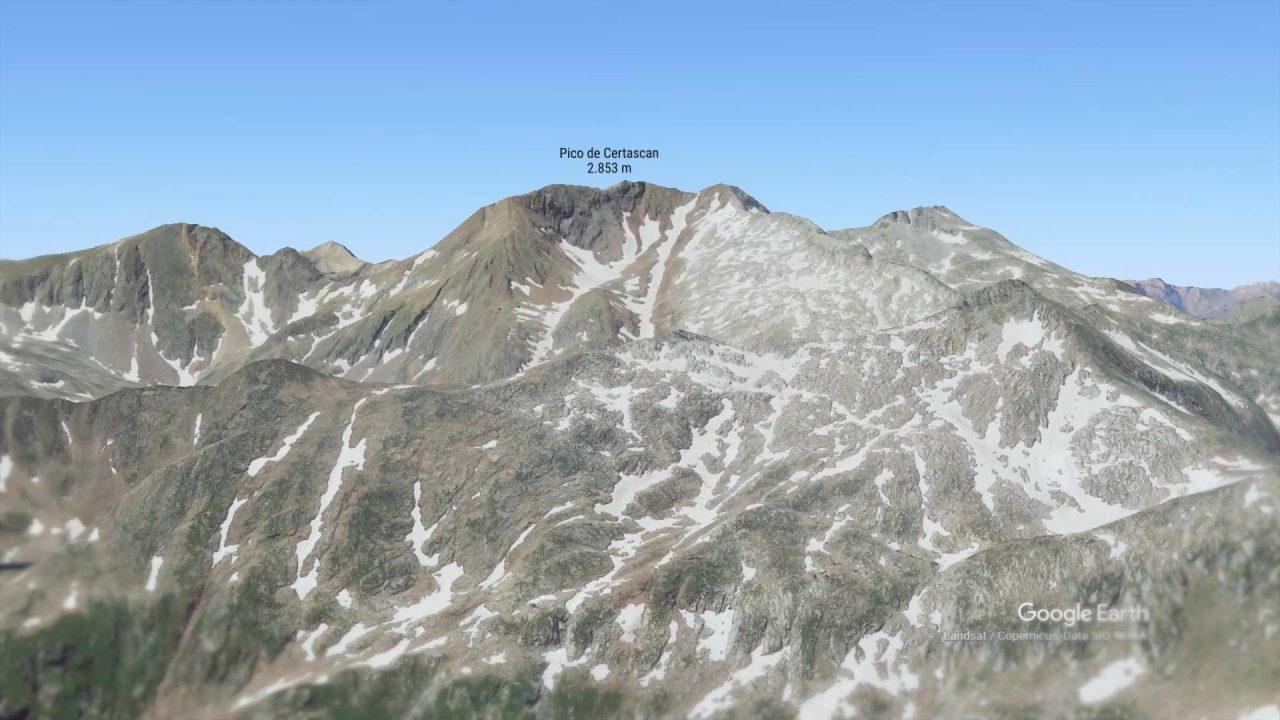
Los datos dan la razón a los mayores: cada vez nieva menos en España
La nieve ha retrocedido en los últimos 50 años tanto en el Pirineo como en Sierra Nevada, las zonas que acumulan más nieve de toda la península.
Interactive
Documentary
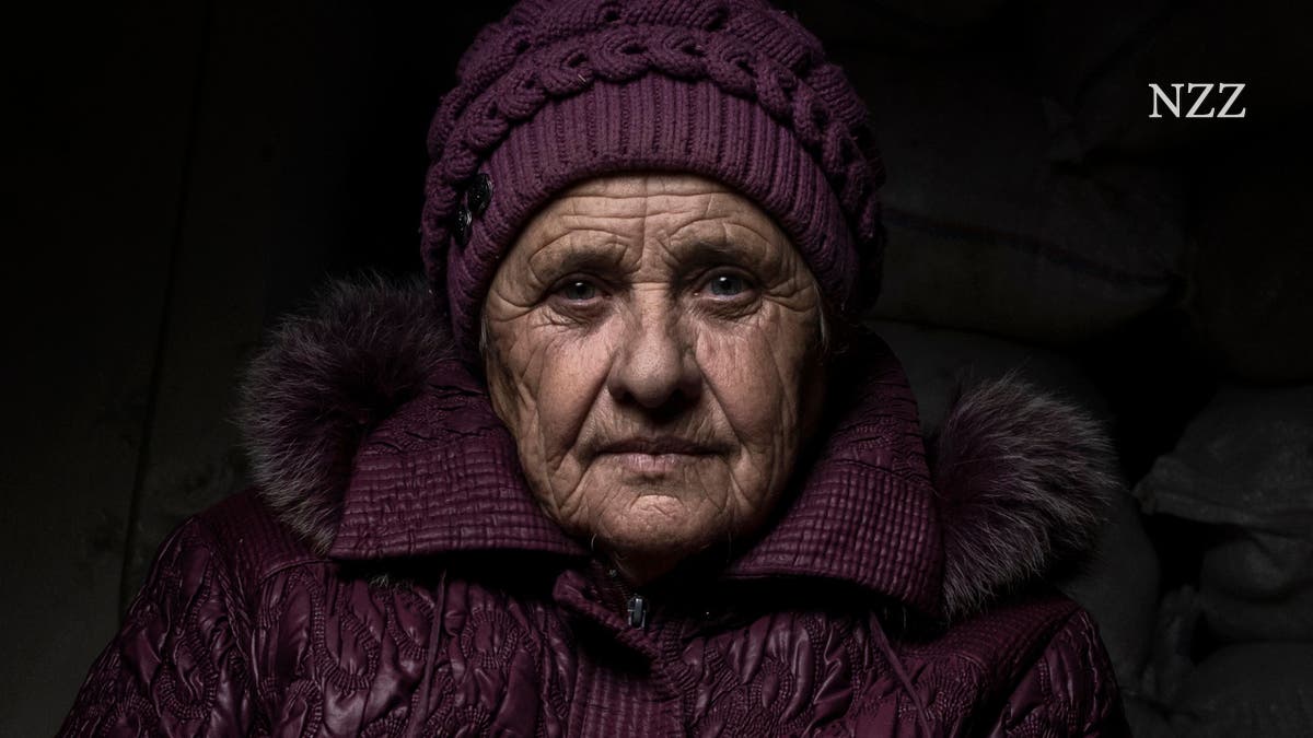
Porträts von Menschen, die im Krieg in der Ukraine ausharren
Der Fotograf Dominic Nahr berichtet seit einem Jahr immer wieder für die NZZ aus der Ukraine. Dabei traf er auf Menschen, auf deren Gesichtern der Krieg tiefe Spuren hinterlassen h...

Dataviz
Multimedia
Tech’s very bad year, in numbers
Why are there so many layoffs in tech right now? The tech industry is readjusting after a pandemic investment boom.
Dataviz
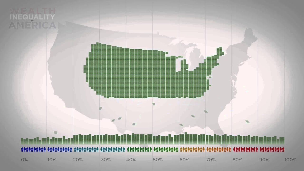
Wealth Inequality in America
Infographics on the distribution of wealth in America, highlighting both the inequality and the difference between our perception of inequality and the actua...

Multimedia
Dataviz
Gone Viral: Covid-19 and 'fake news' in Thailand
An analysis of the distribution and impact of Covid-19 fake news in Thailand, the role of fact checkers and possible solutions to address the problem in the future.

Maps
How the world looked in 1914, at the peak of colonialism
The year was the high-water mark for colonial expansion—and its geographic legacy is still visible on maps today.

Multimedia
Stitch Fix Algorithms Tour
How data science is woven into the fabric of Stitch Fix.
Inspiration of the Week
Multimedia
Dataviz
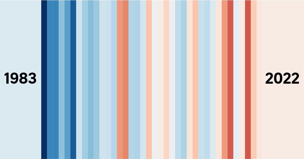
Sleepless in Singapore? Even nights are getting hotter according to 40-year temperature data
Singapore is getting hotter, and that means hotter nights too because even the minimum temperature has seen a long-term trend upwards. Explore our analysis of temperatures over the...

Illustration
Welcome to the Ambaniverse: How one billionaire dominates every aspect of life in India
From food to gadgets to cricket, explore how the business empire of one of the world’s richest men touches the everyday lives of millions in India.

Illustration
Awash in grief
For those who lost a loved one, the pandemic placed obstacle after obstacle along the path to healing, increasing risks of prolonged grief disorder.

Multimedia
The great history of the art of perfumery
The perfumes are equated with works of art, "put on" in the light, and enjoyed alone.

Dataviz
Life Under Curfew — Social Justice Centres Working Group
We put data on the walls in Dandora so our community could read it too.

Multimedia
Illustration
A Woman's World
Access to leisure has always been gendered. How are women championing spaces of recreation for themselves across South and Southeast Asian cities?
Inspiration of the Week

Interactive
Dataviz
Kenyan Youth Trends
An essential visual guide to the trends that will shape the lives of Kenya’s most important generation.